Progress
Progress indicators commonly known as spinners, express an unspecified wait time or display the length of a process. The animation works with CSS, not JavaScript.
Progress indicators inform users about the status of ongoing processes, such as loading an app, submitting a form, or saving updates. They communicate an app’s state and indicate available actions, such as whether users can navigate away from the current screen.
- Determinate indicators display how long an operation will take.
- Indeterminate indicators visualize an unspecified wait time.
When displaying progress for a sequence of processes, indicate overall progress rather than the progress of each activity.
Circular
Circular indeterminate
<CircularProgress />
<CircularProgress color="secondary" /><CircularProgress variant="determinate" value={25} />
<CircularProgress variant="determinate" value={50} />
<CircularProgress variant="determinate" value={75} />
<CircularProgress variant="determinate" value={100} />
<CircularProgress variant="determinate" value={progress} /><CircularProgressWithLabel value={progress} /><LinearProgress />
<LinearProgress color="secondary" /><LinearProgress variant="determinate" value={progress} /><LinearProgress variant="buffer" value={progress} valueBuffer={buffer} />10%
<LinearProgressWithLabel value={progress} />Non-standard ranges
The progress components accept a value in the range 0 - 100. This simplifies things for screen-reader users, where these are the default min / max values. Sometimes, however, you might be working with a data source where the values fall outside this range. Here's how you can easily transform a value in any range to a scale of 0 - 100:
// MIN = Minimum expected value
// MAX = Maximium expected value
// Function to normalise the values (MIN / MAX could be integrated)
const normalise = value => (value - MIN) * 100 / (MAX - MIN);

// Example component that utilizes the `normalise` function at the point of render.
function Progress(props) {
  return (
    <React.Fragment>
      <CircularProgress variant="determinate" value={normalise(props.value)} />
      <LinearProgress variant="determinate" value={normalise(props.value)} />
    </React.Fragment>
  )
}
Customized progress
Here are some examples of customizing the component. You can learn more about this in the overrides documentation page.
Delaying appearance
There are 3 important limits to know around response time.
The ripple effect of the ButtonBase component ensures that the user feels that the system is reacting instantaneously.
Normally, no special feedback is necessary during delays of more than 0.1 but less than 1.0 second.
After 1.0 second, you can display a loader to keep user's flow of thought uninterrupted.
Limitations
Under heavy load, you might lose the stroke dash animation or see random CircularProgress ring widths. You should run processor intensive operations in a web worker or by batch in order not to block the main rendering thread.
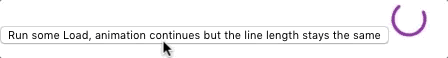
When it's not possible, you can leverage the disableShrink property to mitigate the issue.
See this issue.
<CircularProgress disableShrink />