Customizing components
You can easily customize the appearance of a Material-UI component.
As components can be used in different contexts, there are several approaches to this. Going from the narrowest use-case to the broadest, these are:
- Specific variation for a one-time situation
- Dynamic variation for a one-time situation
- Specific variation of a component re-used in different contexts
- Material Design variations such as with the button component
- Global theme variation
1. Specific variation for a one-time situation
You might need to change the style of a component for a specific implementation, for which you have the following solutions available:
Overriding styles with class names
The first way to override the style of a component is to use class names.
Every component provides a className property which is always applied to the root element.
This example uses the withStyles() higher-order
component to inject custom styles into the DOM, and to pass the class name to the ClassNames component via its classes property.
You can choose any other styling solution, or even plain CSS to create the styles, but be sure to
consider the CSS injection order, as the CSS injected into the DOM
by Material-UI to style a component has the highest specificity possible, since the <link> is injected at the bottom
of the <head /> to ensure the components always render correctly.
Overriding styles with classes
When the className property isn't enough, and you need to access deeper elements, you can take advantage of the classes object property to customize all the CSS injected by Material-UI for a given component.
The list of classes for each component is documented in the component API page, you should refer to the CSS section and rule name column. For instance, you can have a look at the Button CSS API. Alternatively, you can use the browser dev tools.
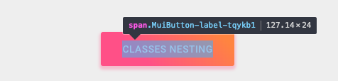
This example also uses withStyles() (see above), but here, ClassesNesting is using Button's classes prop to
provide an object that maps the names of classes to override (style rules) to the CSS class names to apply (values).
The component's existing classes will continue to be injected, so it is only necessary to provide the specific styles
you wish to add or override.
Notice that in addition to the button styling, the button label's capitalization has been changed:
<Button
  classes={{
    root: classes.root, // class name, e.g. `classes-nesting-root-x`
    label: classes.label, // class name, e.g. `classes-nesting-label-x`
  }}
>
  classes nesting
</Button>
Overriding styles with global class names
Using the dev tools
The browser dev tools can save you a lot of time.
Material-UI's class names follow a simple pattern in development mode:
Mui[component name]-[style rule name]-[UUID].
Let's go back to the above demo. How can you override the button label?
Using the dev tools, you know that you need to target the Button component and the label style rule:
<Button classes={{ label: 'my-class-name' }} />Shorthand
The above code example can be condensed by using the same CSS API as the child component.
In this example, the withStyles() higher-order component is injecting a classes property that is used by the Button component.
const StyledButton = withStyles({
  root: {
    background: 'linear-gradient(45deg, #FE6B8B 30%, #FF8E53 90%)',
    borderRadius: 3,
    border: 0,
    color: 'white',
    height: 48,
    padding: '0 30px',
    boxShadow: '0 3px 5px 2px rgba(255, 105, 135, .3)',
  },
  label: {
    textTransform: 'capitalize',
  },
})(Button);<StyledButton>classes shorthand</StyledButton>Pseudo-classes
The components special states, like hover, focus, disabled and selected, are styled with a higher CSS specificity. Specificity is a weight that is applied to a given CSS declaration.
In order to override the components special states, you need to increase specificity.
Here is an example with the disable state and the button component using a pseudo-class (:disabled):
.Button {
  color: black;
}
.Button:disabled { /* Increase the specificity */
  color: white;
}<Button disabled className="Button">Sometimes, you can't use a pseudo-class as the state doesn't exist in the platform.
Let's take the menu item component and the selected state as an example.
Aside from accessing nested elements, the classes property can be used to customize the special states of Material-UI components:
.MenuItem {
  color: black;
}
.MenuItem.selected { /* Increase the specificity */
  color: blue;
}<MenuItem selected classes={{ root: 'MenuItem', selected: 'selected' }}>Why do I need to increase specificity to override one component state?
By design, the CSS specification makes the pseudo-classes increase the specificity. For consistency, Material-UI increases the specificity of its custom pseudo-classes. This has one important advantage, it allows you to cherry-pick the state you want to customize.
Can I use a different API that requires fewer boilerplate?
Instead of providing values to the classes prop API, you can rely on the global class names generated by Material-UI.
It implements all these custom pseudo-classes:
| classes key | Global class name |
|---|---|
| checked | Mui-checked |
| disabled | Mui-disabled |
| error | Mui-error |
| focused | Mui-focused |
| focusVisible | Mui-focusVisible |
| required | Mui-required |
| expanded | Mui-expanded |
| selected | Mui-selected |
.MenuItem {
  color: black;
}
.MenuItem.Mui-selected { /* Increase the specificity */
  color: blue;
}<MenuItem selected className="MenuItem">Use $ruleName to reference a local rule within the same style sheet
The jss-nested plugin (available by default) can make the process of increasing specificity easier.
const styles = {
  root: {
    '&$disabled': {
      color: 'white',
    },
  },
  disabled: {},
};
compiles to:
.root-x.disable-x {
  color: white;
}
⚠️ You need to apply the two generated class names (root & disabled) to the DOM to make it work.
<Button
  disabled
  classes={{
    root: classes.root, // class name, e.g. `root-x`
    disabled: classes.disabled, // class name, e.g. `disabled-x`
  }}
><Button
disabled
classes={{
root: classes.root, // class name, e.g. `root-x`
disabled: classes.disabled, // class name, e.g. `disabled-x`
}}
>
classes state
</Button>Overriding with inline-styles
The second way to override the style of a component is to use the inline-style approach.
Every component provides a style property.
These properties are always applied to the root element.
You don't have to worry about CSS specificity as the inline-style takes precedence over the regular CSS.
<Button style={style}>inline-style</Button>When should I use inline-style vs classes?
2. Dynamic variation for a one-time situation
You have learned how to override the style of a Material-UI component in the previous section. Now, let's see how we can make these overrides dynamic. Here are five alternatives; each has its pros and cons.
Dynamic CSS
<React.Fragment>
  <FormControlLabel
    control={
      <Switch
        checked={color === 'blue'}
        onChange={handleChange}
        color="primary"
        value="dynamic-class-name"
      />
    }
    label="Blue"
  />
  <StyledButton color={color}>Dynamic CSS</StyledButton>
</React.Fragment><React.Fragment>
<FormControlLabel
control={
<Switch
checked={color === blue}
onChange={handleChange}
color="primary"
value="dynamic-class-name"
/>
}
label="Blue"
/>
<Button className={classes.button} style={color}>
{'CSS variables'}
</Button>
</React.Fragment>3. Specific variation of a component
You might need to create a variation of a component and use it in different contexts, for instance a colorful button on your product page, however you probably want to keep your code DRY.
The best approach is to follow option 1 and then take advantage of the composition power of React by exporting your customized component to use wherever you need it.
<ClassNames>Component</ClassNames>4. Material Design variations
The Material Design specification documents different variations of certain components, such as how buttons come in different shapes: text (formerly "flat"), contained (formerly "raised"), FAB and more.
Material-UI attempts to implement all of these variations. Please refer to the Supported Components documentation to find out the current status of all supported Material Design components.
5. Global theme variation
In order to promote consistency between components, and manage the user interface appearance as a whole, Material-UI provides a mechanism to apply global changes.
The demos of this section covers how to the change the button's font size.
Theme variables
You can adjust the theme configuration variables.
const theme = createTheme({
  typography: {
    button: {
      fontSize: '1rem',
    },
  },
});<ThemeProvider theme={theme}>
<Button>font-size: 1rem</Button>
</ThemeProvider>Global CSS override
You can also customize all instances of a component with CSS. Components expose global class names to enable this. It's very similar to how you would customize Bootstrap.
const GlobalCss = withStyles({
  // @global is handled by jss-plugin-global.
  '@global': {
    // You should target [class*="MuiButton-root"] instead if you nest themes.
    '.MuiButton-root': {
      fontSize: '1rem',
    },
  },
})(() => null);

// …

<GlobalCss /><React.Fragment>
<GlobalCss />
<Button>font-size: 1rem</Button>
</React.Fragment>Global theme override
You can take advantage of the overrides key of the theme to potentially change every single style injected by Material-UI into the DOM.
Learn more about it in the themes section of the documentation.
const theme = createTheme({
  overrides: {
    MuiButton: {
      root: {
        fontSize: '1rem',
      },
    },
  },
});<ThemeProvider theme={theme}>
<Button>font-size: 1rem</Button>
</ThemeProvider>