Personalizando componentes
Los componentes Material-UI pueden ser personalizados de forma sencilla.
Como los componentes pueden ser utilizados en diferentes contextos, hay varios enfoques acerca de esto. Yendo desde el caso de uso más especifico hasta aquellos más amplios, tenemos:
- Variación específica para una situación única
- Variación dinámica para una situación única
- Variación específica de un componente reutilizado en diferentes contextos
- variaciones de Diseño Material tal como el componente del botón
- Variación global del tema
1. Variación específica para una situación única
Tal vez necesitara cambiar el estilo de un componente para una implementación especifica, para lo cual tendrá estas soluciones a su disposición:
Sobre-escribir estilos con class names
La forma mas natural de sobre-escribir el estilo de un componente es usando class names. Cada componente proporciona la propiedad className la cual es siempre aplicada al elemento raíz.
El siguiente ejemplo usa withStyles como un componente HOC,(high-order component), para inyectar estilos customizados en el DOM, y para pasar el class name al componente ClassNames mediante su propiedad classes. Puedes elegir cualquier otra solución de estilo, o incluso CSS para crear los estilos, pero asegúrate de considerar el orden de inyección CSS, como el CSS inyectado en el DOM por Material-UI para diseñar un componente tiene la mayor especificidad posible, ya que el <link> se inyecta en la parte inferior del <head /> para asegurar que los componentes siempre se renderizan correctamente.
Overriding styles with classes
Cuando la propiedad className no es suficiente, y necesitas acceder a elementos más profundos, puedes aprovechar la propiedad de objetos clases para personalizar todo el CSS inyectado por Material-UI para un componente determinado.
La lista de clases para cada componente está documentada en la página API del componente, debes referirte a la sección CSS y a la columna nombre de regla. Por ejemplo, puedes echar un vistazo a la API CSS de Button. Como alternativa, puedes utilizar las herramientas de desarrollo del navegador.
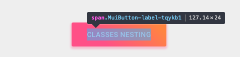
Este ejemplo también utiliza withStyles() (ver arriba), pero aquí, ClassesNesting está usando Button's classes prop a proporcionar un objeto que mapea los nombres de clases para anular (reglas de estilo) a los nombres de la clase CSS para aplicar (valores). The component's existing classes will continue to be injected, so it is only necessary to provide the specific styles you wish to add or override.
Notice that in addition to the button styling, the button label's capitalization has been changed:
<Button
  classes={{
    root: classes.root, // class name, e.g. `classes-nesting-root-x`
    label: classes.label, // class name, e.g. `classes-nesting-label-x`
  }}
>
  classes nesting
</Button>
Overriding styles with global class names
Usando las herramientas de dev
Las herramientas de desarrollo del navegador pueden ahorrarte mucho tiempo. Material-UI's class names follow a simple pattern in development mode: Mui[component name]-[style rule name]-[UUID].
Volvamos a la demo anterior. ¿Cómo puedes reemplazar la etiqueta del botón?
Using the dev tools, you know that you need to target the Button component and the label style rule:
<Button classes={{ label: 'my-class-name' }} />Shorthand
The above code example can be condensed by using the same CSS API as the child component. In this example, the withStyles() higher-order component is injecting a classes property that is used by the Button component.
const StyledButton = withStyles({
  root: {
    background: 'linear-gradient(45deg, #FE6B8B 30%, #FF8E53 90%)',
    borderRadius: 3,
    border: 0,
    color: 'white',
    height: 48,
    padding: '0 30px',
    boxShadow: '0 3px 5px 2px rgba(255, 105, 135, .3)',
  },
  label: {
    textTransform: 'capitalize',
  },
})(Button);<StyledButton>classes shorthand</StyledButton>Pseudo-classes
The components special states, like hover, focus, disabled and selected, are styled with a higher CSS specificity. Specificity is a weight that is applied to a given CSS declaration.
In order to override the components special states, you need to increase specificity. Here is an example with the disable state and the button component using a pseudo-class (:disabled):
.Button {
  color: black;
}
.Button:disabled { /* Increase the specificity */
  color: white;
}<Button disabled className="Button">A veces, no puedes usar pseudo-class ya que el estado no existe en la plataforma. Let's take the menu item component and the selected state as an example. Aside from accessing nested elements, the classes property can be used to customize the special states of Material-UI components:
.MenuItem {
  color: black;
}
.MenuItem.selected { /* Increase the specificity */
  color: blue;
}<MenuItem selected classes={{ root: 'MenuItem', selected: 'selected' }}>Why do I need to increase specificity to override one component state?
By design, the CSS specification makes the pseudo-classes increase the specificity. For consistency, Material-UI increases the specificity of its custom pseudo-classes. This has one important advantage, it allows you to cherry-pick the state you want to customize.
Can I use a different API that requires fewer boilerplate?
Instead of providing values to the classes prop API, you can rely on the global class names generated by Material-UI. It implements all these custom pseudo-classes:
| classes key | Global class name |
|---|---|
| checked | Mui-checked |
| disabled | Mui-disabled |
| error | Mui-error |
| focused | Mui-focused |
| focusVisible | Mui-focusVisible |
| required | Mui-required |
| expanded | Mui-expanded |
| selected | Mui-selected |
.MenuItem {
  color: black;
}
.MenuItem.Mui-selected { /* Increase the specificity */
  color: blue;
}<MenuItem selected className="MenuItem">Use $ruleName to reference a local rule within the same style sheet
The jss-nested plugin (available by default) can make the process of increasing specificity easier.
const styles = {
  root: {
    '&$disabled': {
      color: 'white',
    },
  },
  disabled: {},
};
compiles to:
.root-x.disable-x {
  color: white;
}
⚠️ You need to apply the two generated class names (root & disabled) to the DOM to make it work.
<Button
  disabled
  classes={{
    root: classes.root, // class name, e.g. `root-x`
    disabled: classes.disabled, // class name, e.g. `disabled-x`
  }}
><Button
disabled
classes={{
root: classes.root, // class name, e.g. `root-x`
disabled: classes.disabled, // class name, e.g. `disabled-x`
}}
>
classes state
</Button>Overriding with inline-styles
The second way to override the style of a component is to use the inline-style approach. Every component provides a style property. These properties are always applied to the root element.
You don't have to worry about CSS specificity as the inline-style takes precedence over the regular CSS.
<Button style={style}>inline-style</Button>When should I use inline-style vs classes?
2. Variación dinámica para una situación única
You have learned how to override the style of a Material-UI component in the previous section. Now, let's see how we can make these overrides dynamic. Here are five alternatives; each has its pros and cons.
Dynamic CSS
<React.Fragment>
  <FormControlLabel
    control={
      <Switch
        checked={color === 'blue'}
        onChange={handleChange}
        color="primary"
        value="dynamic-class-name"
      />
    }
    label="Blue"
  />
  <StyledButton color={color}>Dynamic CSS</StyledButton>
</React.Fragment><React.Fragment>
<FormControlLabel
control={
<Switch
checked={color === blue}
onChange={handleChange}
color="primary"
value="dynamic-class-name"
/>
}
label="Blue"
/>
<Button className={classes.button} style={color}>
{'CSS variables'}
</Button>
</React.Fragment>3. Specific variation of a component
You might need to create a variation of a component and use it in different contexts, for instance a colorful button on your product page, however you probably want to keep your code DRY.
The best approach is to follow option 1 and then take advantage of the composition power of React by exporting your customized component to use wherever you need it.
<ClassNames>Component</ClassNames>4. Material Design variations
The Material Design specification documents different variations of certain components, such as how buttons come in different shapes: text (formerly "flat"), contained (formerly "raised"), FAB and more.
Material-UI attempts to implement all of these variations. Please refer to the Supported Components documentation to find out the current status of all supported Material Design components.
5. Variación global del tema
In order to promote consistency between components, and manage the user interface appearance as a whole, Material-UI provides a mechanism to apply global changes.
The demos of this section covers how to the change the button's font size.
Theme variables
You can adjust the theme configuration variables.
const theme = createTheme({
  typography: {
    button: {
      fontSize: '1rem',
    },
  },
});<ThemeProvider theme={theme}>
<Button>font-size: 1rem</Button>
</ThemeProvider>Global CSS override
You can also customize all instances of a component with CSS. It's very similar to how you would customize Bootstrap. Components expose global class names to enable this.
const GlobalCss = withStyles({
  // @global is handled by jss-plugin-global.
  '@global': {
    // You should target [class*="MuiButton-root"] instead if you nest themes.
    '.MuiButton-root': {
      fontSize: '1rem',
    },
  },
})(() => null);

// …

<GlobalCss /><React.Fragment>
<GlobalCss />
<Button>font-size: 1rem</Button>
</React.Fragment>Global theme override
You can take advantage of the overrides key of the theme to potentially change every single style injected by Material-UI into the DOM. Learn more about it in the themes section of the documentation.
const theme = createTheme({
  overrides: {
    MuiButton: {
      root: {
        fontSize: '1rem',
      },
    },
  },
});<ThemeProvider theme={theme}>
<Button>font-size: 1rem</Button>
</ThemeProvider>