Color
Transmitir significado a través del color. Ahora mismo se puede acceder a todos los colores en la especificación de diseño de Material Design.
El sistema de color Material Design se puede utilizar para crear un tema de color que refleje su marca o estilo.
Picking colors
Herramienta oficial de color
The Material Design team has also built an awesome palette configuration tool: material.io/resources/color/. This can help you create a color palette for your UI, as well as measure the accessibility level of any color combination.
The output can be fed into createTheme() function:
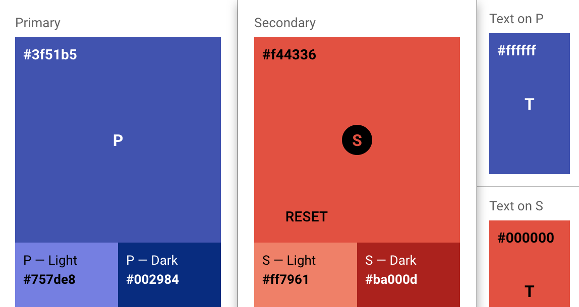
import { createTheme } from '@material-ui/core/styles';

const theme = createTheme({
  palette: {
    primary: {
      light: '#757ce8',
      main: '#3f50b5',
      dark: '#002884',
      contrastText: '#fff',
    },
    secondary: {
      light: '#ff7961',
      main: '#f44336',
      dark: '#ba000d',
      contrastText: '#000',
    },
  },
});
Campo de pruebas
To test a material.io/design/color color scheme with the Material-UI documentation, simply select colors using the palette and sliders below. Como alternativa, se pueden escribir valores hexadecimales en los campos de text Primary (color primario) y Secondary (color secundario).
Shade:
500
Shade:
A400
{
  palette: {
    primary: blue,
    secondary: pink,
  },
}The output shown in the color sample can be pasted directly into a createTheme() function (to be used with ThemeProvider):
import { createTheme } from '@material-ui/core/styles';
import purple from '@material-ui/core/colors/purple';

const theme = createTheme({
  palette: {
    primary: {
      main: purple[500],
    },
    secondary: {
      main: '#f44336',
    },
  },
});
Only the main shades need be provided (unless you wish to further customize light, dark or contrastText), as the other colors will be calculated by createTheme(), as described in the Theme customization section.
If you are using the default primary and / or secondary shades then by providing the color object, createTheme() will use the appropriate shades from the material color for main, light and dark.
Herramientas de la comunidad
- create-mui-theme: Is an online tool for creating Material-UI themes via Material Design Color Tool.
- material-ui-theme-editor: A tool to generate themes for your Material-UI applications by just selecting the colors and having a live preview.
- Material palette generator: The Material palette generator can be used to generate a palette for any color you input.
2014 Material Design color palettes
These color palettes, originally created by Material Design in 2014, are comprised of colors designed to work together harmoniously, and can be used to develop your brand palette. To generate your own harmonious palettes, use the palette generation tool.
Términos importantes
- Palette: A palette is a collection of colors, i.e. hues and their shades. Material-UI proporciona todos los colores incluidos en las pautas de Material Design. Esta paleta de colores ha sido diseñada con colores que funcionan en armonía unos con otros.
- Hue" & "Shade: A single color within the palette is made up of a hue such as "red", and shade, such as "500". "rojo 50" es el tono más claro de rojo (¡rosa!), mientras que "rojo 900" es el más oscuro. Además, la mayoría de los matices vienen con tonos de "acento", prefijados con una
A.
Paleta de colores
Dado un HUE (matiz) (rojo, rosa, etc.) y una SHADE (tono) (500, 600, etc.) se puede importar el color así:
import HUE from '@material-ui/core/colors/HUE';

const color = HUE[SHADE];- red500#f44336
- 50#ffebee
- 100#ffcdd2
- 200#ef9a9a
- 300#e57373
- 400#ef5350
- 500#f44336
- 600#e53935
- 700#d32f2f
- 800#c62828
- 900#b71c1c
- A100#ff8a80
- A200#ff5252
- A400#ff1744
- A700#d50000
- pink500#e91e63
- 50#fce4ec
- 100#f8bbd0
- 200#f48fb1
- 300#f06292
- 400#ec407a
- 500#e91e63
- 600#d81b60
- 700#c2185b
- 800#ad1457
- 900#880e4f
- A100#ff80ab
- A200#ff4081
- A400#f50057
- A700#c51162
- purple500#9c27b0
- 50#f3e5f5
- 100#e1bee7
- 200#ce93d8
- 300#ba68c8
- 400#ab47bc
- 500#9c27b0
- 600#8e24aa
- 700#7b1fa2
- 800#6a1b9a
- 900#4a148c
- A100#ea80fc
- A200#e040fb
- A400#d500f9
- A700#aa00ff
- deepPurple500#673ab7
- 50#ede7f6
- 100#d1c4e9
- 200#b39ddb
- 300#9575cd
- 400#7e57c2
- 500#673ab7
- 600#5e35b1
- 700#512da8
- 800#4527a0
- 900#311b92
- A100#b388ff
- A200#7c4dff
- A400#651fff
- A700#6200ea
- indigo500#3f51b5
- 50#e8eaf6
- 100#c5cae9
- 200#9fa8da
- 300#7986cb
- 400#5c6bc0
- 500#3f51b5
- 600#3949ab
- 700#303f9f
- 800#283593
- 900#1a237e
- A100#8c9eff
- A200#536dfe
- A400#3d5afe
- A700#304ffe
- blue500#2196f3
- 50#e3f2fd
- 100#bbdefb
- 200#90caf9
- 300#64b5f6
- 400#42a5f5
- 500#2196f3
- 600#1e88e5
- 700#1976d2
- 800#1565c0
- 900#0d47a1
- A100#82b1ff
- A200#448aff
- A400#2979ff
- A700#2962ff
- lightBlue500#03a9f4
- 50#e1f5fe
- 100#b3e5fc
- 200#81d4fa
- 300#4fc3f7
- 400#29b6f6
- 500#03a9f4
- 600#039be5
- 700#0288d1
- 800#0277bd
- 900#01579b
- A100#80d8ff
- A200#40c4ff
- A400#00b0ff
- A700#0091ea
- cyan500#00bcd4
- 50#e0f7fa
- 100#b2ebf2
- 200#80deea
- 300#4dd0e1
- 400#26c6da
- 500#00bcd4
- 600#00acc1
- 700#0097a7
- 800#00838f
- 900#006064
- A100#84ffff
- A200#18ffff
- A400#00e5ff
- A700#00b8d4
- teal500#009688
- 50#e0f2f1
- 100#b2dfdb
- 200#80cbc4
- 300#4db6ac
- 400#26a69a
- 500#009688
- 600#00897b
- 700#00796b
- 800#00695c
- 900#004d40
- A100#a7ffeb
- A200#64ffda
- A400#1de9b6
- A700#00bfa5
- green500#4caf50
- 50#e8f5e9
- 100#c8e6c9
- 200#a5d6a7
- 300#81c784
- 400#66bb6a
- 500#4caf50
- 600#43a047
- 700#388e3c
- 800#2e7d32
- 900#1b5e20
- A100#b9f6ca
- A200#69f0ae
- A400#00e676
- A700#00c853
- lightGreen500#8bc34a
- 50#f1f8e9
- 100#dcedc8
- 200#c5e1a5
- 300#aed581
- 400#9ccc65
- 500#8bc34a
- 600#7cb342
- 700#689f38
- 800#558b2f
- 900#33691e
- A100#ccff90
- A200#b2ff59
- A400#76ff03
- A700#64dd17
- lime500#cddc39
- 50#f9fbe7
- 100#f0f4c3
- 200#e6ee9c
- 300#dce775
- 400#d4e157
- 500#cddc39
- 600#c0ca33
- 700#afb42b
- 800#9e9d24
- 900#827717
- A100#f4ff81
- A200#eeff41
- A400#c6ff00
- A700#aeea00
- yellow500#ffeb3b
- 50#fffde7
- 100#fff9c4
- 200#fff59d
- 300#fff176
- 400#ffee58
- 500#ffeb3b
- 600#fdd835
- 700#fbc02d
- 800#f9a825
- 900#f57f17
- A100#ffff8d
- A200#ffff00
- A400#ffea00
- A700#ffd600
- amber500#ffc107
- 50#fff8e1
- 100#ffecb3
- 200#ffe082
- 300#ffd54f
- 400#ffca28
- 500#ffc107
- 600#ffb300
- 700#ffa000
- 800#ff8f00
- 900#ff6f00
- A100#ffe57f
- A200#ffd740
- A400#ffc400
- A700#ffab00
- orange500#ff9800
- 50#fff3e0
- 100#ffe0b2
- 200#ffcc80
- 300#ffb74d
- 400#ffa726
- 500#ff9800
- 600#fb8c00
- 700#f57c00
- 800#ef6c00
- 900#e65100
- A100#ffd180
- A200#ffab40
- A400#ff9100
- A700#ff6d00
- deepOrange500#ff5722
- 50#fbe9e7
- 100#ffccbc
- 200#ffab91
- 300#ff8a65
- 400#ff7043
- 500#ff5722
- 600#f4511e
- 700#e64a19
- 800#d84315
- 900#bf360c
- A100#ff9e80
- A200#ff6e40
- A400#ff3d00
- A700#dd2c00
- brown500#795548
- 50#efebe9
- 100#d7ccc8
- 200#bcaaa4
- 300#a1887f
- 400#8d6e63
- 500#795548
- 600#6d4c41
- 700#5d4037
- 800#4e342e
- 900#3e2723
- grey500#9e9e9e
- 50#fafafa
- 100#f5f5f5
- 200#eeeeee
- 300#e0e0e0
- 400#bdbdbd
- 500#9e9e9e
- 600#757575
- 700#616161
- 800#424242
- 900#212121
- blueGrey500#607d8b
- 50#eceff1
- 100#cfd8dc
- 200#b0bec5
- 300#90a4ae
- 400#78909c
- 500#607d8b
- 600#546e7a
- 700#455a64
- 800#37474f
- 900#263238
Ejemplos
For instance, you can refer to complementary primary and accent colors, "red 500" and "purple A200" like so:
import purple from '@material-ui/core/colors/purple';
import red from '@material-ui/core/colors/red';

const primary = red[500]; // #f44336
const accent = purple['A200']; // #e040fb
const accent = purple.A200; // #e040fb (alternative method)