Text Field (Текстовое поле)
Текстовые поля позволяют пользователям вводить и редактировать текст.
Текстовые поля позволяют пользователям вводить текст в интерфейсе. Обычно они появляются в формах и диалогах.
Текстовое поля
TextField представляет собой полноценный элемент управления формы, включая метку (label), само поле ввода и вспомогательный текст.
It supports standard, outlined and filled styling.
<form className={classes.root} noValidate autoComplete="off">
  <TextField id="standard-basic" label="Standard" />
  <TextField id="filled-basic" label="Filled" variant="filled" />
  <TextField id="outlined-basic" label="Outlined" variant="outlined" />
</form>
Note: The standard variant of the TextField is no longer documented in the Material Design guidelines (here's why), but Material-UI will continue to support it.
Form props
The underlying DOM nodes should have this structure: In order for the text field to be accessible, the input should be linked to the label and the helper text.
Validation
The error prop toggles the error state, the helperText prop can then be used to provide feedback to the user about the error.
Multiline
The multiline prop transforms the text field into a textarea or a TextareaAutosize.
Select (Список)
The select prop makes the text field use the Select component internally.
Украшения поля ввода (Input)
The main way is with an InputAdornment. Например, вы можете использовать кнопку-иконку, чтобы скрыть или показать пароль. This can be used to add a prefix, a suffix or an action to an input.
Kg
Kg
Weight
$
Kg
Kg
Weight
$
Kg
Kg
Weight
$
Расположение
dense and normal alter other styles to meet the specification. margin prop can be used to alter the vertical spacing of inputs. Using none (default) will not apply margins to the FormControl, whereas dense and normal will.
fullWidth can be used to make the input take up the full width of its container.
Full width!
Some important text
Some important text
Some important text
Full width!
Some important text
Some important text
Some important text
Full width!
Some important text
Some important text
Some important text
Компоненты
TextField состоит из более мелких компонентов ( FormControl, Input, FilledInput, InputLabel, OutlinedInput, и FormHelperText ) которые вы можете использовать напрямую, чтобы значительно кастомизировать ваши поля ввода.
Вы также могли заметить, что некоторые нативные свойства ввода HTML отсутствуют в компоненте TextField. Это сделано специально. Компонент включает в себя наиболее часто используемые свойства, а для расширенного использования можно использовать базовый компонент, показанный в следующей демонстрации. Вы все еще можете использовать inputProps (и свойства InputProps, InputLabelProps), если хотите избежать излишнего кода.
<form className={classes.root} noValidate autoComplete="off">
  <Input defaultValue="Hello world" inputProps={{ 'aria-label': 'description' }} />
  <Input placeholder="Placeholder" inputProps={{ 'aria-label': 'description' }} />
  <Input defaultValue="Disabled" disabled inputProps={{ 'aria-label': 'description' }} />
  <Input defaultValue="Error" error inputProps={{ 'aria-label': 'description' }} />
</form><form className={classes.root} noValidate autoComplete="off">
<TextField id="standard-secondary" label="Standard secondary" color="secondary" />
<TextField
id="filled-secondary"
label="Filled secondary"
variant="filled"
color="secondary"
/>
<TextField
id="outlined-secondary"
label="Outlined secondary"
variant="outlined"
color="secondary"
/>
</form>Кастомизированные поля ввода
Ниже находятся примеры кастомизации компонента. You can learn more about this in the overrides documentation page.
Настройка не ограничивается CSS, вы можете использовать композицию для создания пользовательских компонентов и придать вашему приложению уникальный стиль. Ниже приведен пример использования компонента InputBase, вдохновленный Google Maps.
🎨 If you are looking for inspiration, you can check MUI Treasury's customization examples.
Ограничения
Сжатие
Состояние метки поля ввода (label) "shrink" не всегда корректно. Предполагается, что метка поля ввода уменьшается, как только в поле ввода что-нибудь отображается. В некоторых случаях мы не можем определить состояние "shrink" (числовое поле, поле даты, Stripe input). Вы могли заметить совпадения.
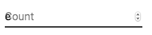
Чтобы решить эту проблему, вы можете принудительно изменить состояние метки.
<TextField InputLabelProps={{ shrink: true }} />или
<InputLabel shrink>Contagem</InputLabel>Плавающая метка
Плавающий ярлык абсолютно позиционируется, он не повлияет на макет страницы. Необходимо убедиться, что поле ввода больше, чем метка для корректного отображения.
Интеграция с сторонними библиотеками текстовых полей
Вы можете использовать сторонние библиотеки для форматирования ввода. Вы должны предоставить пользовательскую реализацию элемента <input> со свойством inputComponent.
В следующем примере используются библиотеки response-text-mask и response-number-format. The same concept could be applied to e.g. react-stripe-element.
Предоставленный компонент ввода должен обрабатывать свойство inputRef. Свойство должно вызываться со значением, которое реализует следующий интерфейс:
interface InputElement {
  focus(): void;
  value?: string;
}
function MyInputComponent(props) {
const { component: Component, inputRef, ...other } = props;
// implement `InputElement` interface
React.useImperativeHandle(inputRef, () => ({
focus: () => {
// logic to focus the rendered component from 3rd party belongs here
},
// hiding the value e.g. react-stripe-elements
}));
// `Component` will be your `SomeThirdPartyComponent` from below
return <Component {...other} />;
}
// usage
<TextField
InputProps={{
inputComponent: MyInputComponent,
inputProps: { component: SomeThirdPartyComponent },
}}
/>;Доступность
In order for the text field to be accessible, the input should be linked to the label and the helper text. The underlying DOM nodes should have this structure:
<div class="form-control">
  <label for="my-input">Адрес электронной почты</label>
  <input id="my-input" aria-describedby="my-helper-text" />
  <span id="my-helper-text">Мы никогда не распостраним ваш адрес.</span>
</div>- Если вы используете компонент
TextField, вам просто нужно предоставить уникальныйid. - Если вы составляете компонент:
<FormControl>
  <InputLabel htmlFor="my-input">Адрес электронной почты</InputLabel>
  <Input id="my-input" aria-describedby="my-helper-text" />
  <FormHelperText id="my-helper-text">Мы никогда не распостраним ваш адрес.</FormHelperText>
</FormControl>
Дополнительные проекты
Для более сложных вариантов использования вы можете воспользоваться:
- formik-material-ui Bindings for using Material-UI with formik.
- redux-form-material-ui Bindings for using Material-UI with Redux Form.
- mui-rff Bindings for using Material-UI with React Final Form.