Прогресс
Progress indicators commonly known as spinners, express an unspecified wait time or display the length of a process. The animation works with CSS, not JavaScript.
Индикаторы прогресса информируют пользователей о состоянии текущих процессов, таких как загрузка приложения, отправка формы или сохранение обновлений. Они сообщают о состоянии приложения и указывают возможные действия, например, могут ли пользователи уходить с текущего экрана.
- Детерменированные индикаторы показывают, сколько времени займет операция.
- Недетерминированные индикаторы отображают неопределенное время ожидания.
Отображая прогресс последовательности процессов, укажите общий прогресс, а не прогресс каждого отдельного действия.
Circular
Circular indeterminate
<CircularProgress />
<CircularProgress color="secondary" /><CircularProgress variant="determinate" value={25} />
<CircularProgress variant="determinate" value={50} />
<CircularProgress variant="determinate" value={75} />
<CircularProgress variant="determinate" value={100} />
<CircularProgress variant="determinate" value={progress} /><CircularProgressWithLabel value={progress} /><LinearProgress />
<LinearProgress color="secondary" /><LinearProgress variant="determinate" value={progress} /><LinearProgress variant="buffer" value={progress} valueBuffer={buffer} />10%
<LinearProgressWithLabel value={progress} />Non-standard ranges
Компоненты прогресса принимают значение в диапазоне от 0 до 100. Это упрощает работу с программами для чтения с экрана ("скринридеры"), где это минимальные и максимальные значения по умолчанию. Однако иногда вы можете работать с данными, значения которых выходят за пределы этого диапазона. Вот так можно легко преобразовать значение из любого диапазона в шкалу от 0 до 100:
// MIN = Minimum expected value
// MAX = Maximium expected value
// Function to normalise the values (MIN / MAX could be integrated)
const normalise = value => (value - MIN) * 100 / (MAX - MIN);

// Example component that utilizes the `normalise` function at the point of render.
function Progress(props) {
  return (
    <React.Fragment>
      <CircularProgress variant="determinate" value={normalise(props.value)} />
      <LinearProgress variant="determinate" value={normalise(props.value)} />
    </React.Fragment>
  )
}
Customized progress
Ниже находятся примеры кастомизации компонента. You can learn more about this in the overrides documentation page.
Delaying appearance
There are 3 important limits to know around response time. The ripple effect of the ButtonBase component ensures that the user feels that the system is reacting instantaneously. Normally, no special feedback is necessary during delays of more than 0.1 but less than 1.0 second. After 1.0 second, you can display a loader to keep user's flow of thought uninterrupted.
Ограничения
Under heavy load, you might lose the stroke dash animation or see random CircularProgress ring widths. You should run processor intensive operations in a web worker or by batch in order not to block the main rendering thread.
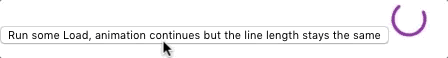
When it's not possible, you can leverage the disableShrink property to mitigate the issue. See this issue.
<CircularProgress disableShrink />